WEDDING COLOUR PALETTE IDEAS
6 Luxury Palettes from Real Weddings — and How to Choose Yours
Almost every couple starts here: 'what are our wedding colours?' It's the right instinct — your palette is the thread that ties your florals, linens, stationery, lighting and decor into one cohesive look. But a palette is more than two swatches. It's a feeling, and the way you layer and balance it is what separates a pretty wedding from a breathtaking one.
Ethereal Creators is a Toronto luxury wedding floral and decor studio — a Canadian Event Awards 2026 winner and WedLuxe Glitterati member. Below are six of our favourite wedding colour palettes, each from a real celebration we've designed, with how to use it and who it's best for — followed by a quick guide to choosing your own.
How Do You Choose a Wedding Colour Palette?
To choose a wedding colour palette, start with the feeling you want (romantic, modern, timeless, bold), then factor in your venue and season, and pick one dominant colour with one or two supporting tones plus a metallic. A reliable rule: keep about 70% of the room neutral so your 30% of colour reads as intentional. The palettes below show how this works across very different styles.
6 Luxury Wedding Colour Palettes
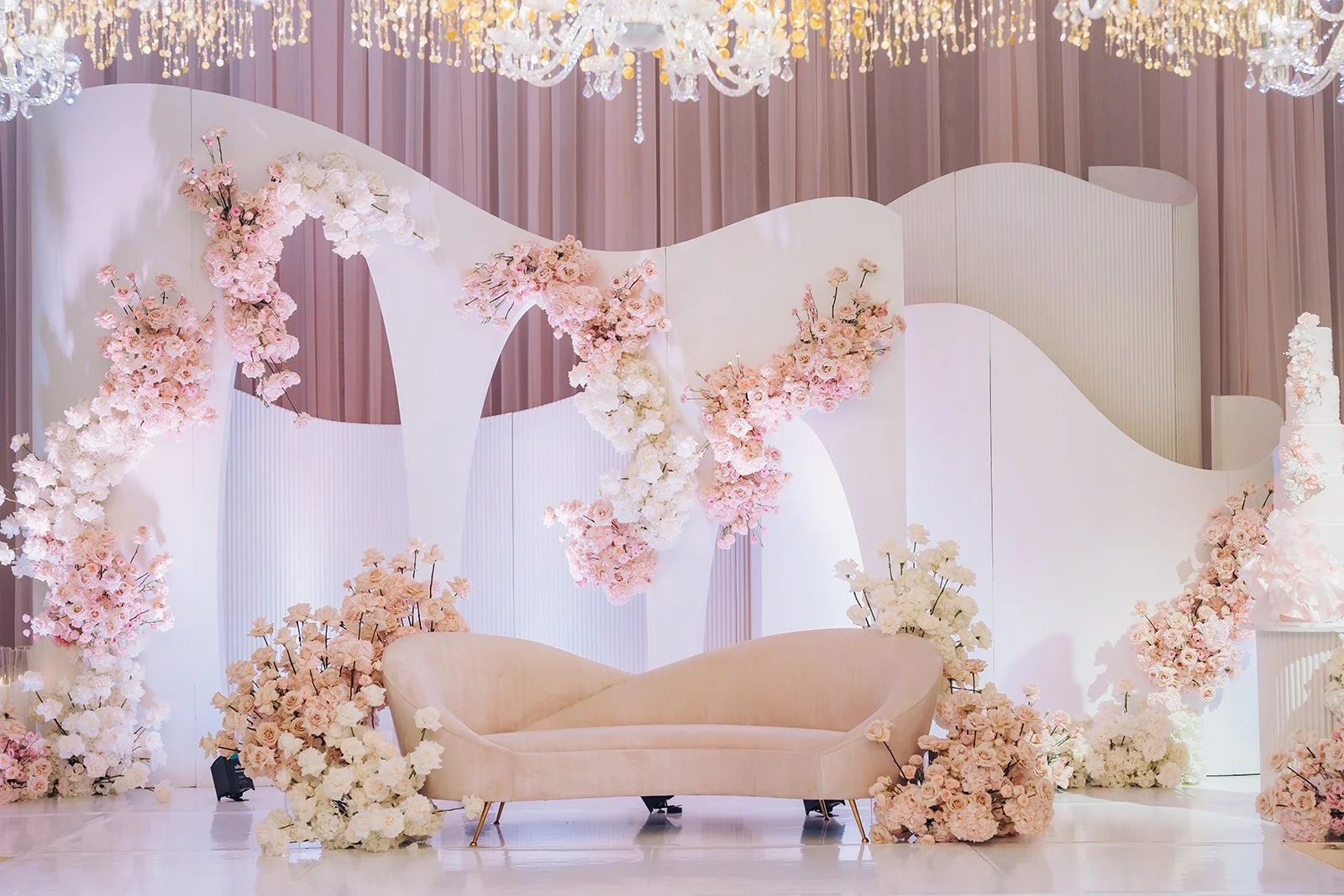
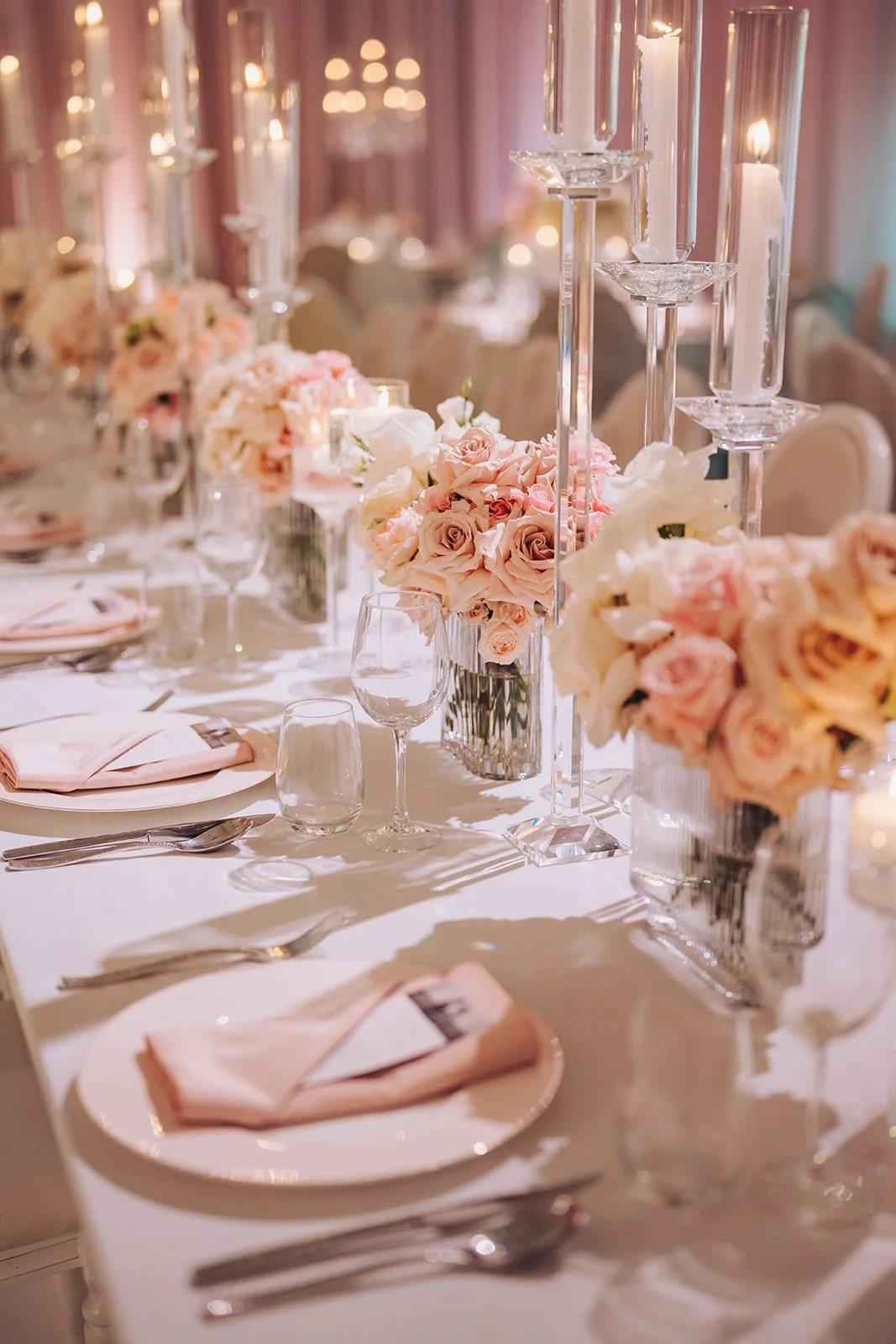
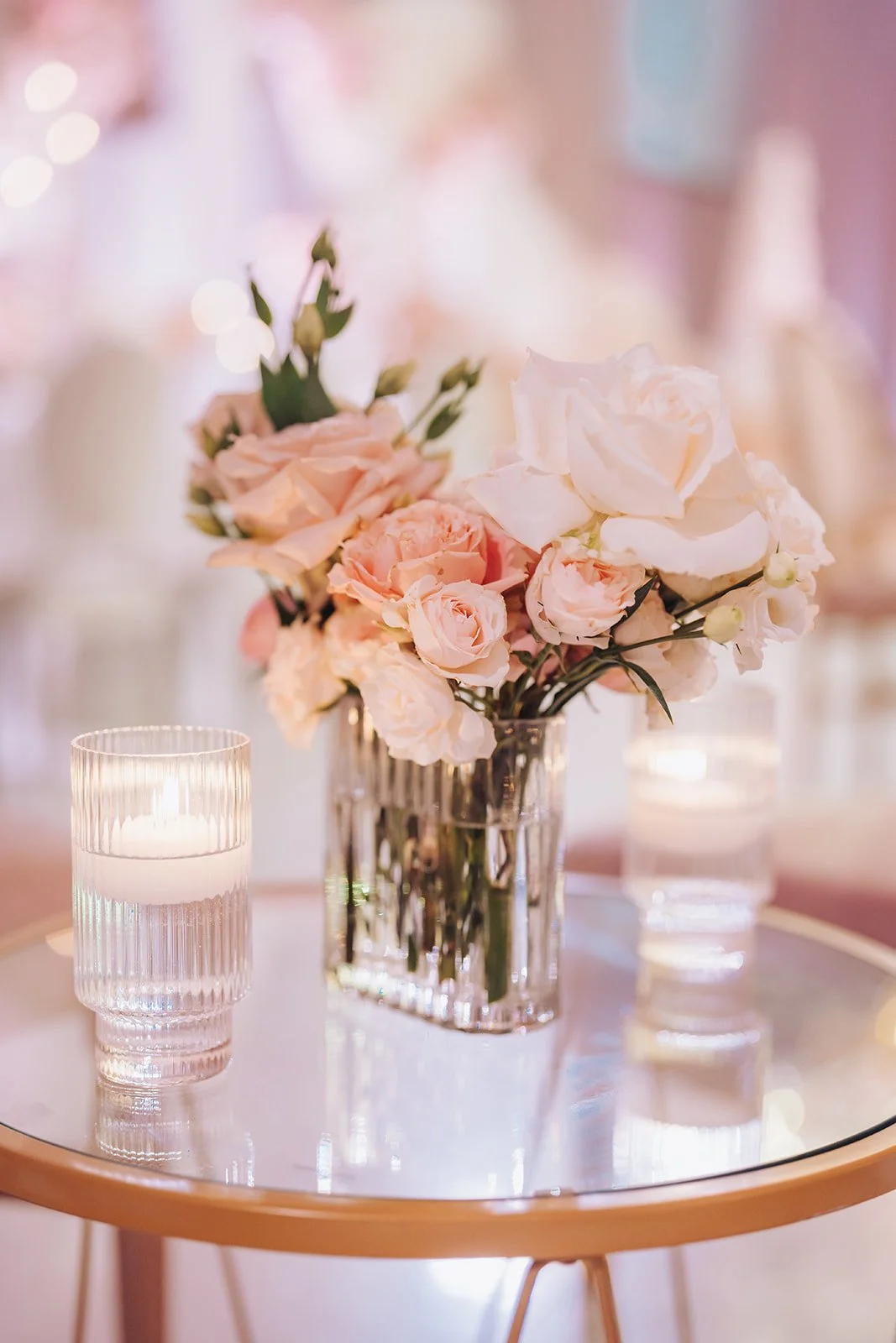
1. Blush & Gold — Romantic & Timeless
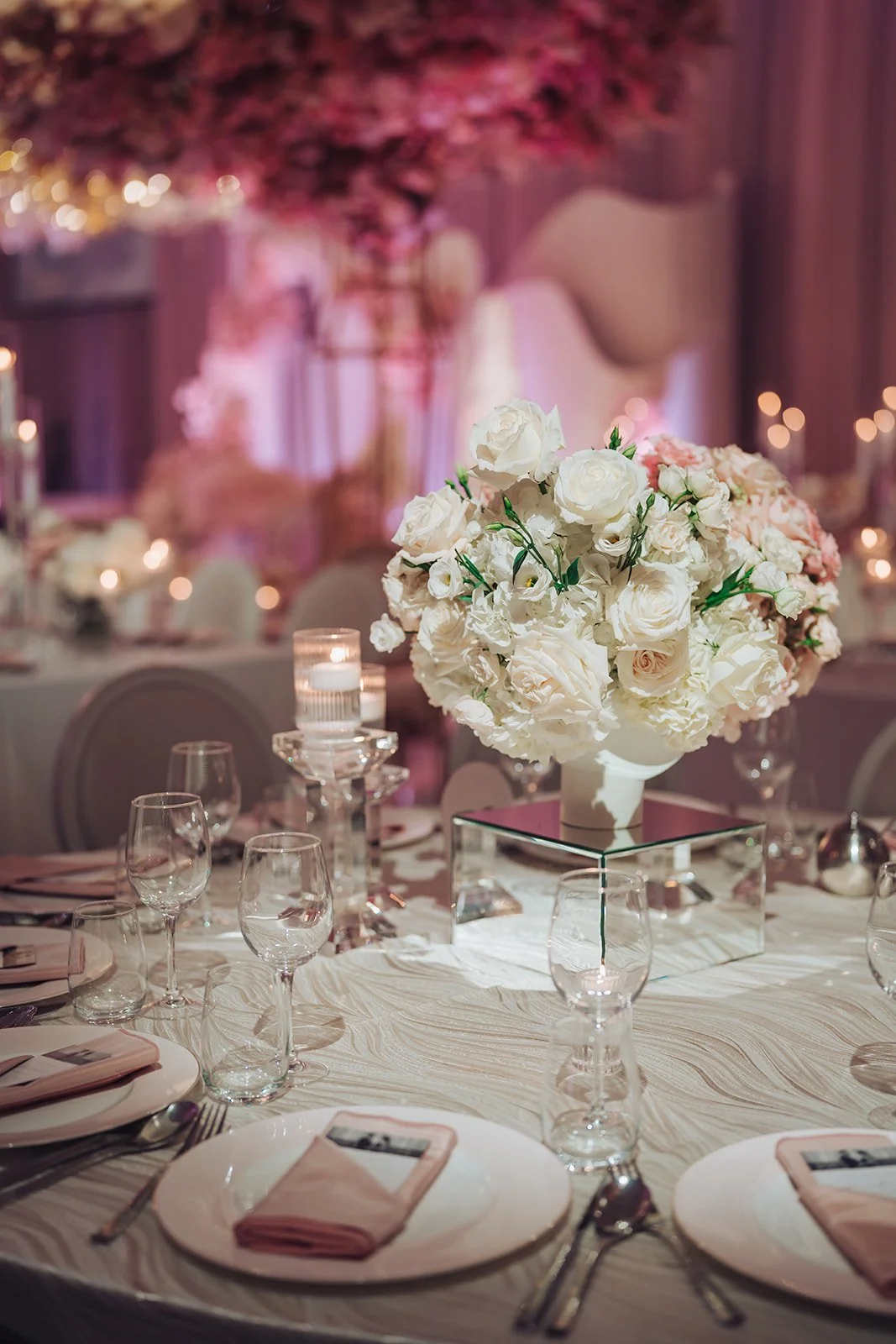
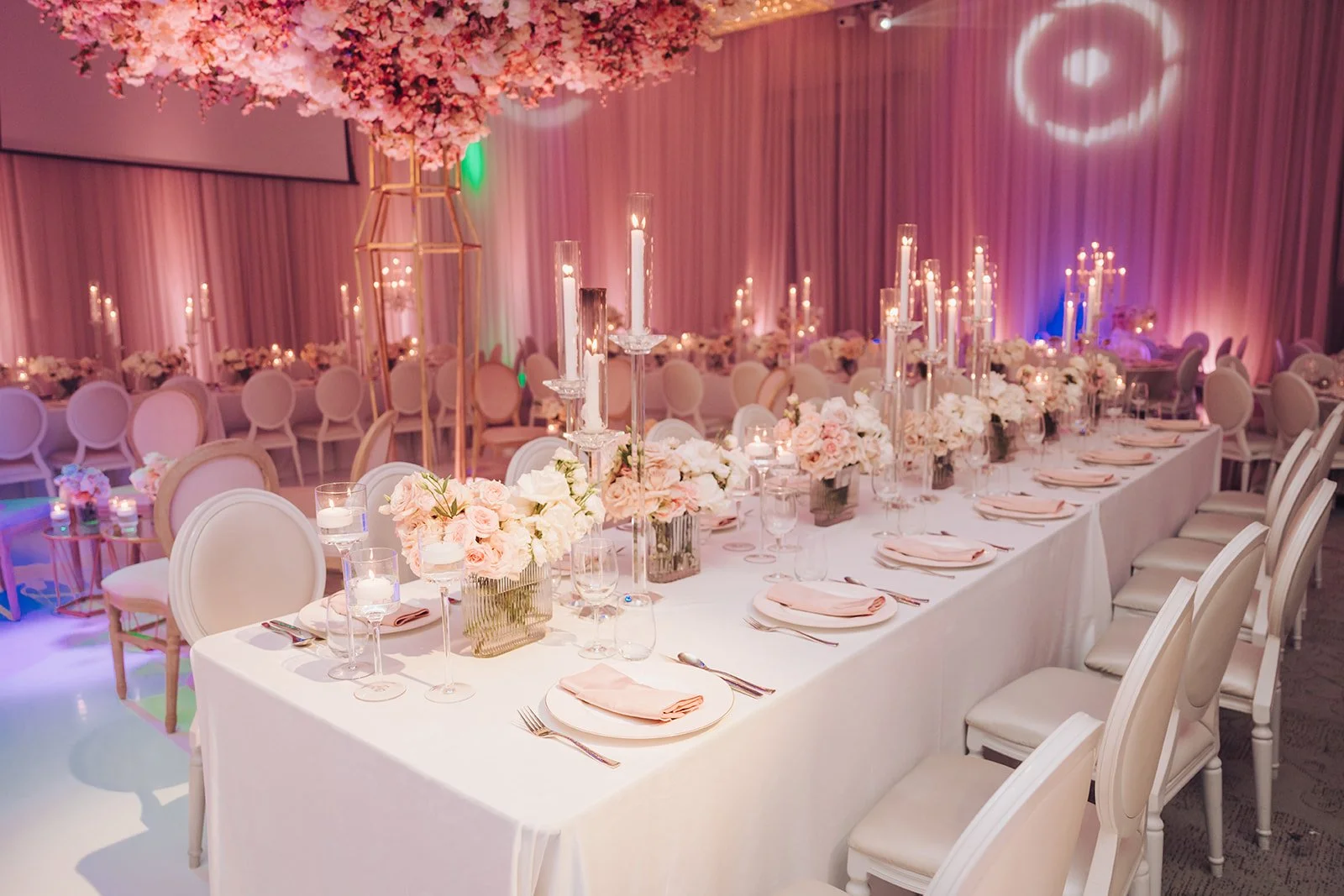
Soft pink paired with warm gold is the ultimate romantic palette. At Harneet & Gary's wedding at Château Le Parc, we layered blush and ivory roses, crystal and gold, and a cherry-blossom ceiling to prove that blush, done at scale with rich texture, is pure romance — never washed out.
Best for: Classic, romantic and fairy-tale weddings; couples who love soft, feminine luxury.
Designer tip: Blush can read flat on its own — warm it with gold and layer crystal, mirror and velvet so the palette feels rich and dimensional.
2. Tangerine & Green — Bold & Modern
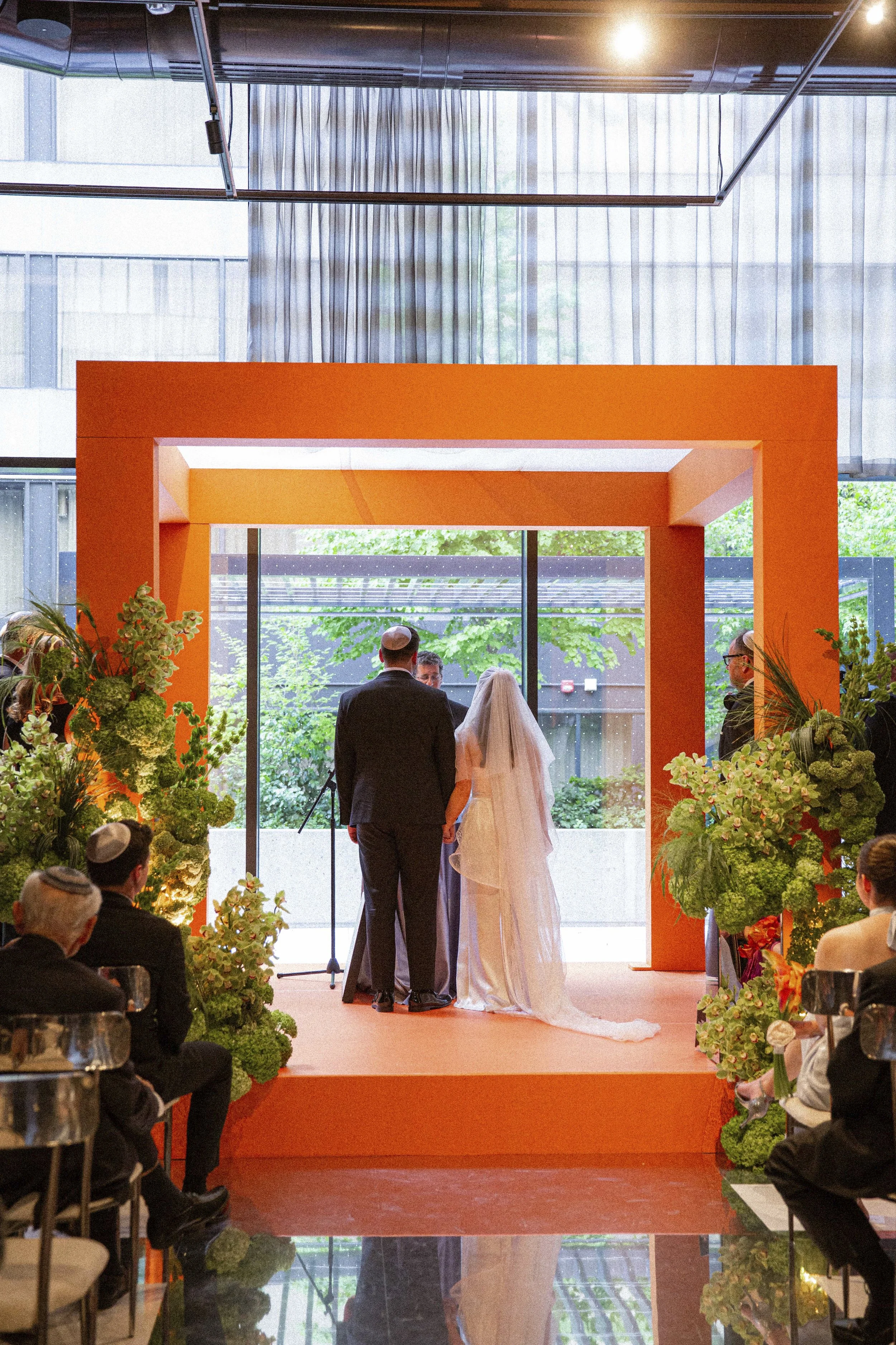
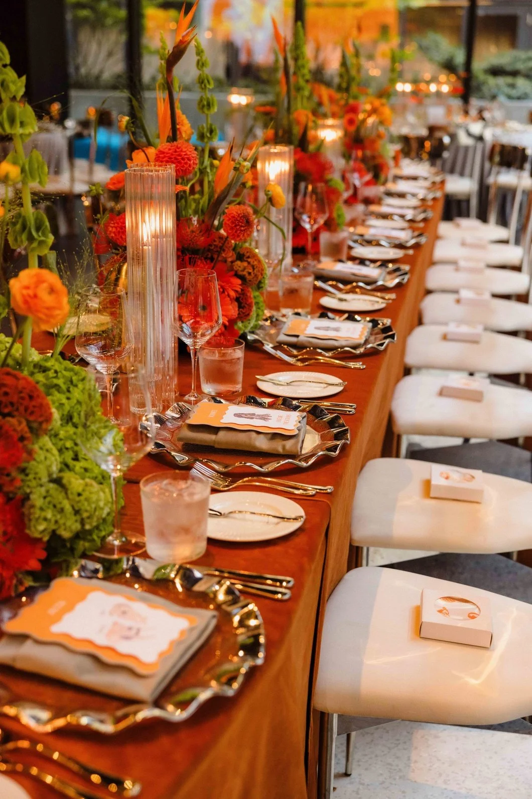
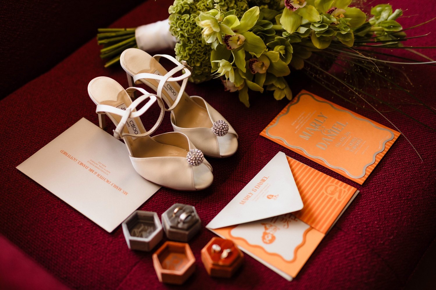
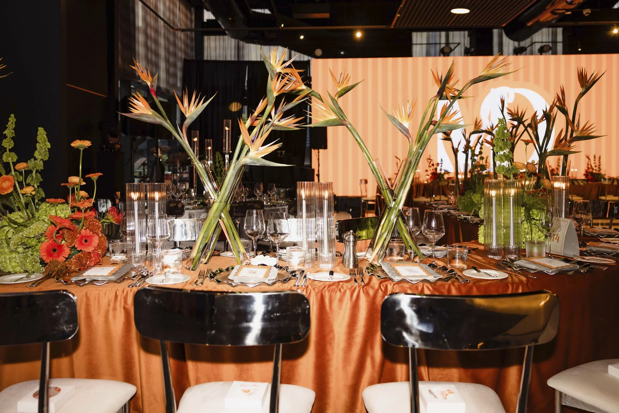
For couples who want nothing expected, vivid tangerine grounded by lush architectural greens is fearless and fashion-forward. At Marly & Daniel's wedding at W Toronto, we built the whole celebration around this palette — a tangerine portal, birds-of-paradise tablescapes, and mirrored accents — for a look unlike anyone else's.
Best for: Modern, design-forward couples who want a confident, statement palette.
Designer tip: If you love colour, commit fully and keep the rest of the room clean and modern. A bold palette works best when it's the clear hero, not competing with other colours.
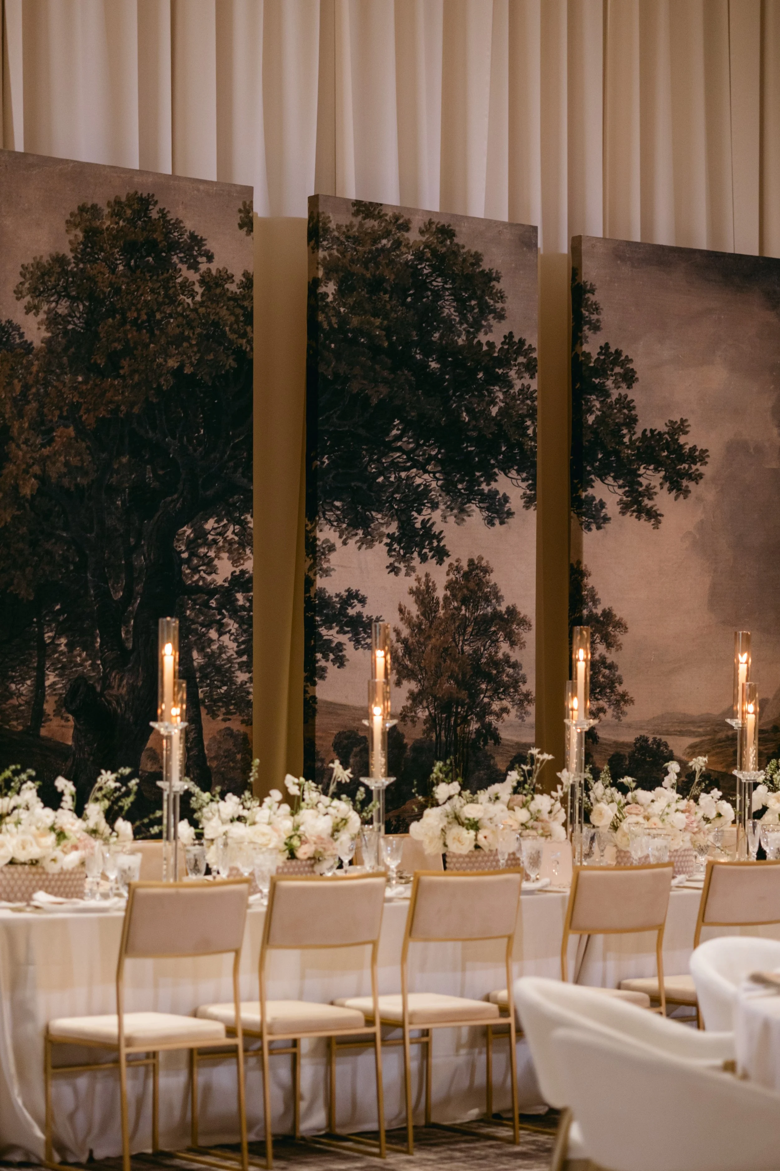
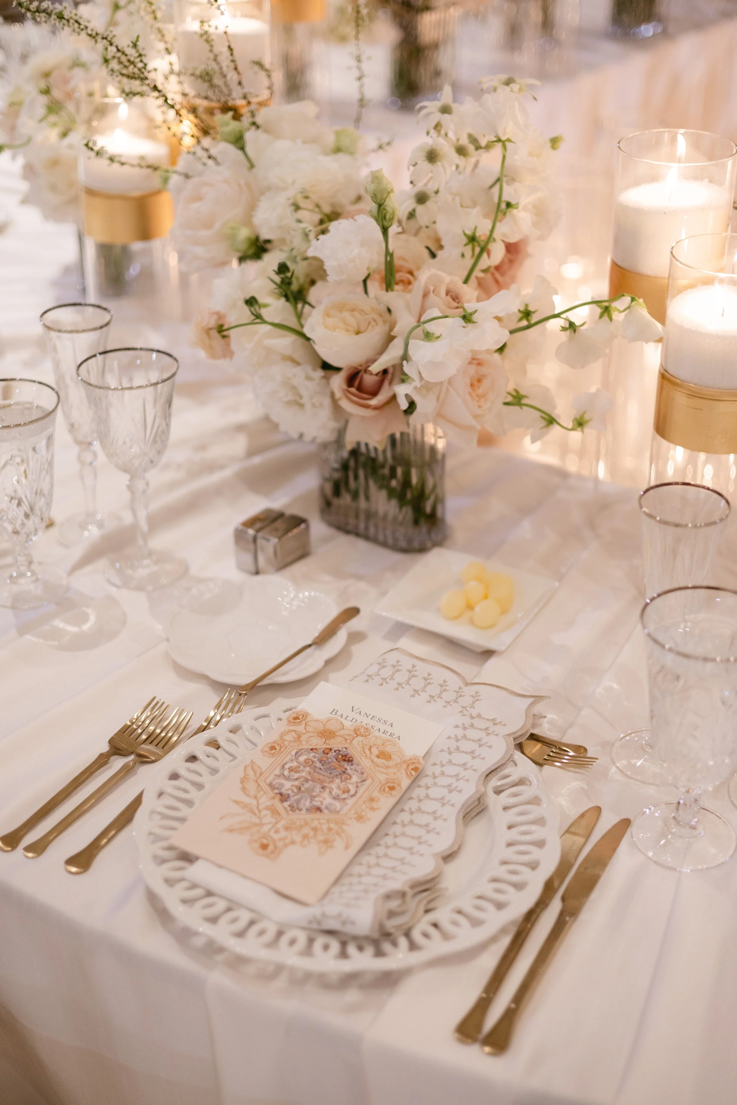
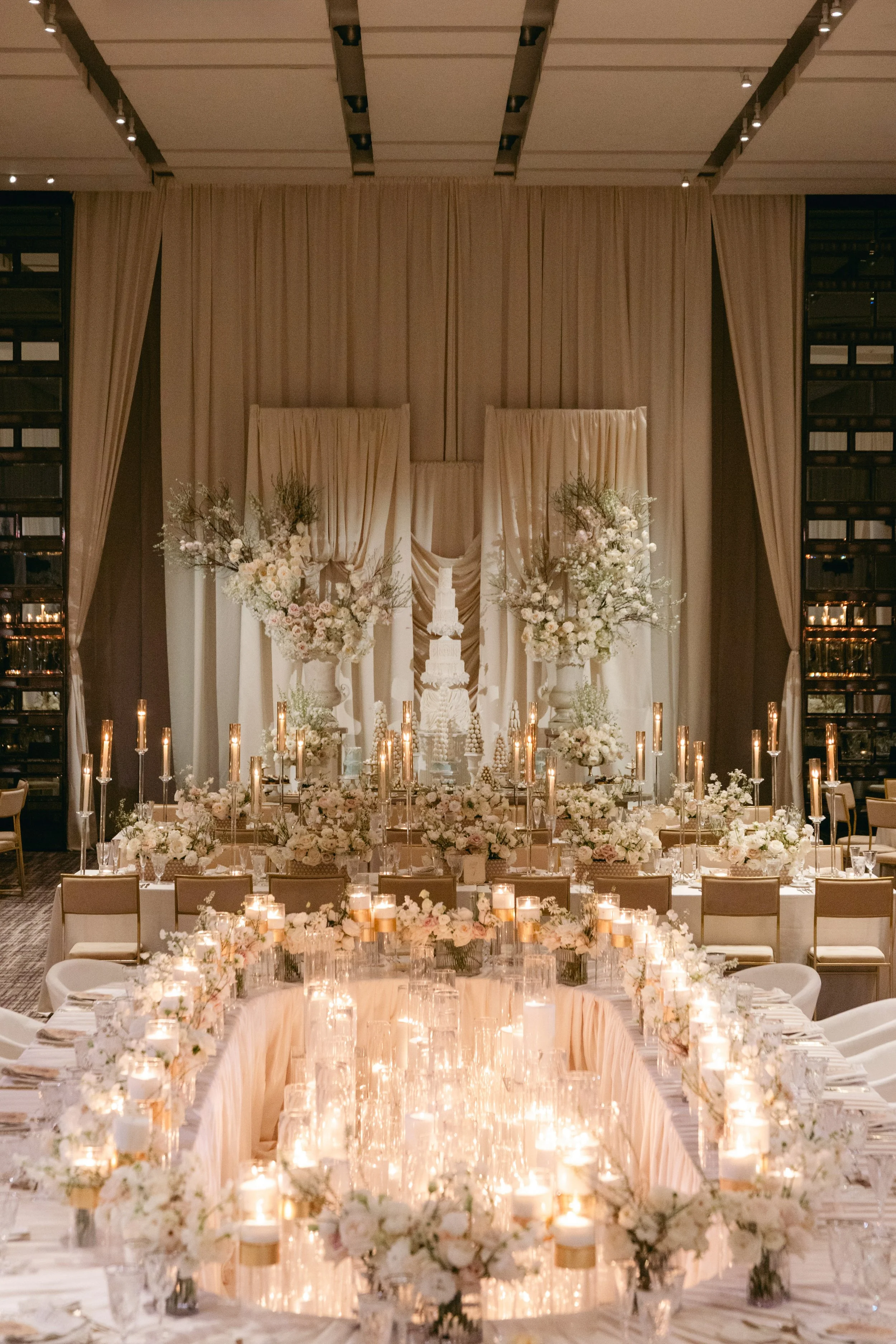
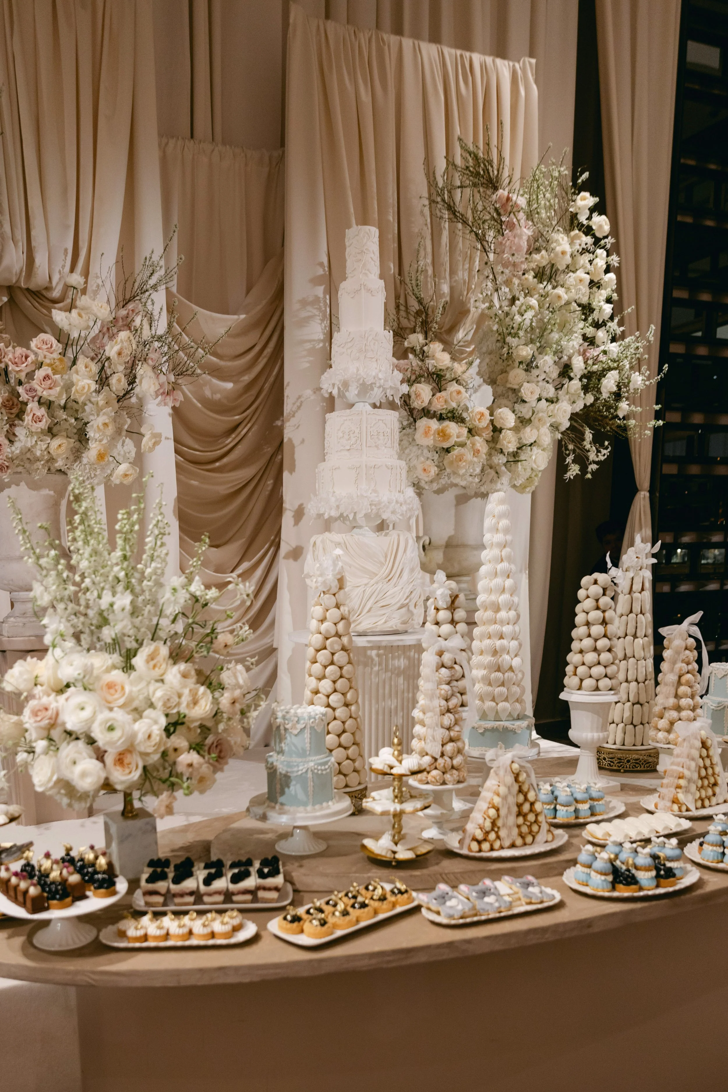
3. Ivory & Champagne — Soft & Elegant
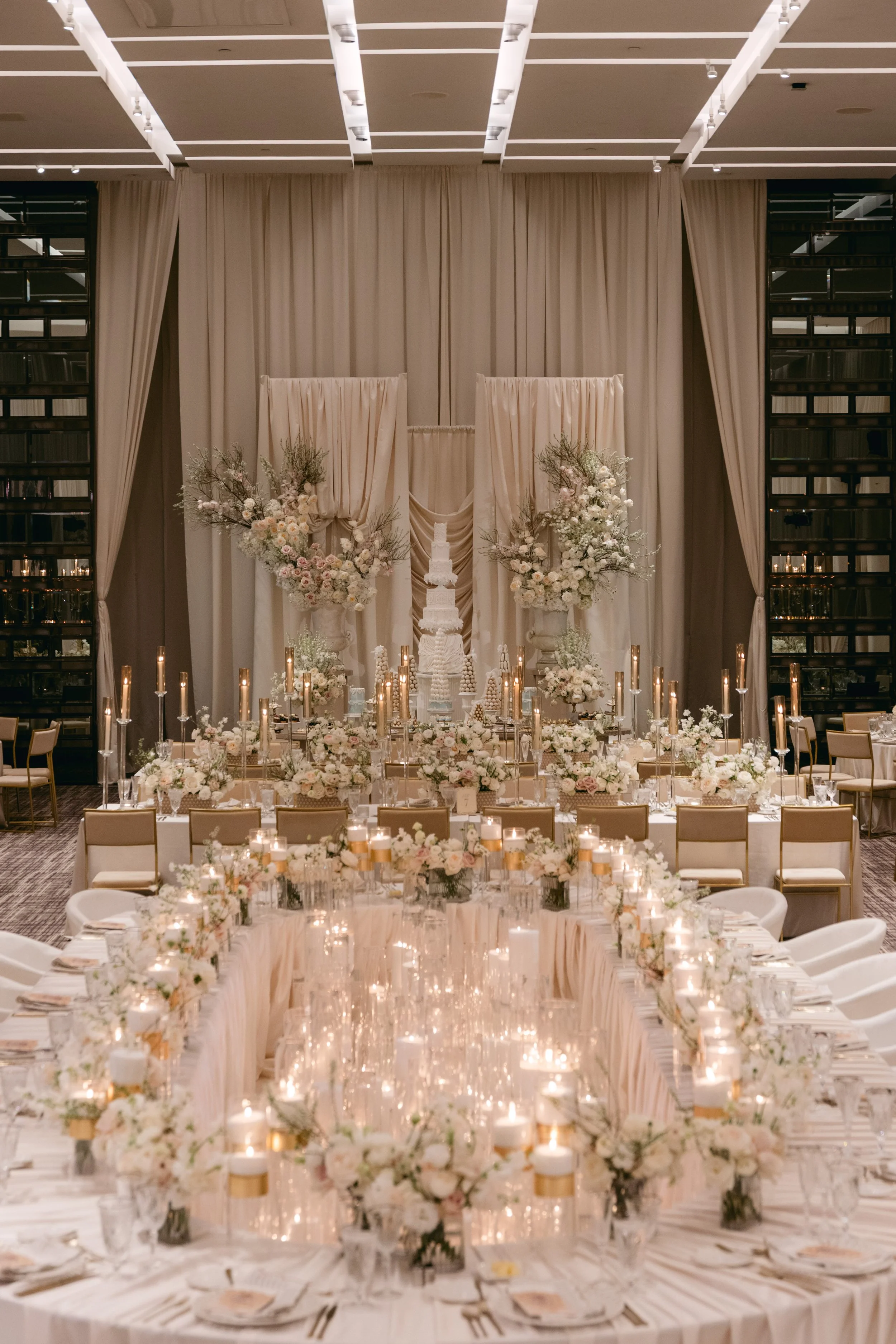
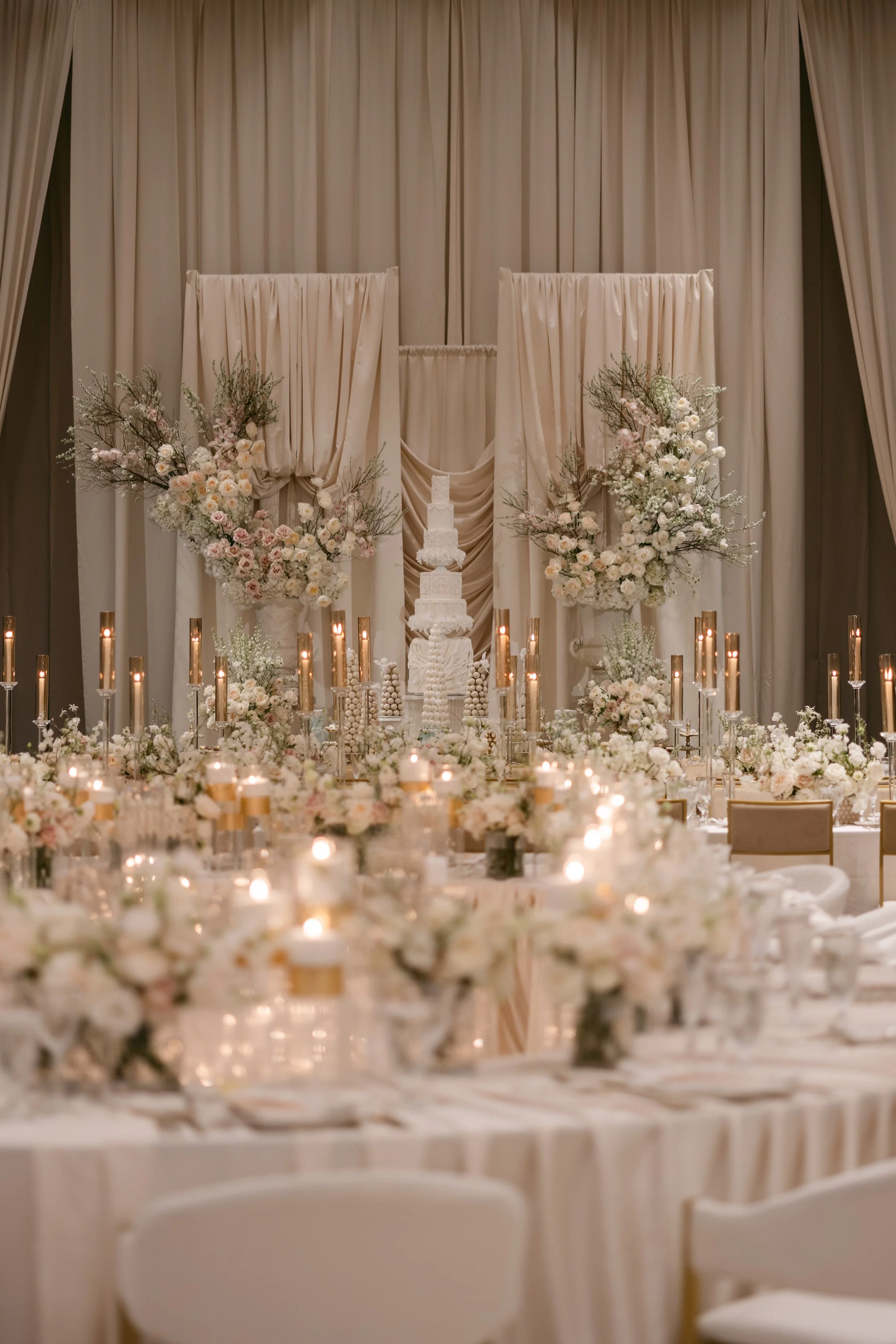
An all-neutral palette is the quietest kind of luxury. At Vanessa & Bruno's wedding at the Four Seasons, layered champagne draping, white florals and abundant gold candlelight created a soft, romantic glow that felt timeless and effortlessly refined.
Best for: Couples who love understated, timeless elegance and want a palette that never dates.
Designer tip: Neutral doesn't mean flat. Layer at least three textures — drape, florals and candlelight — so an ivory palette reads rich and intentional, not empty.
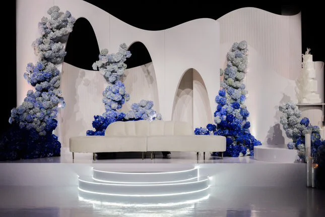
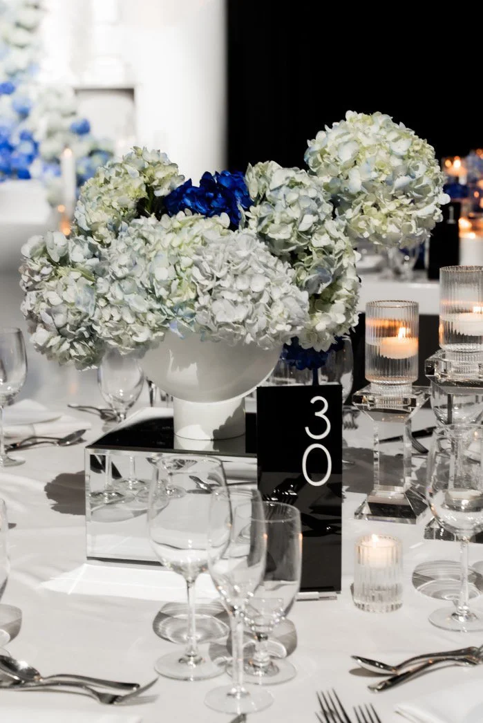
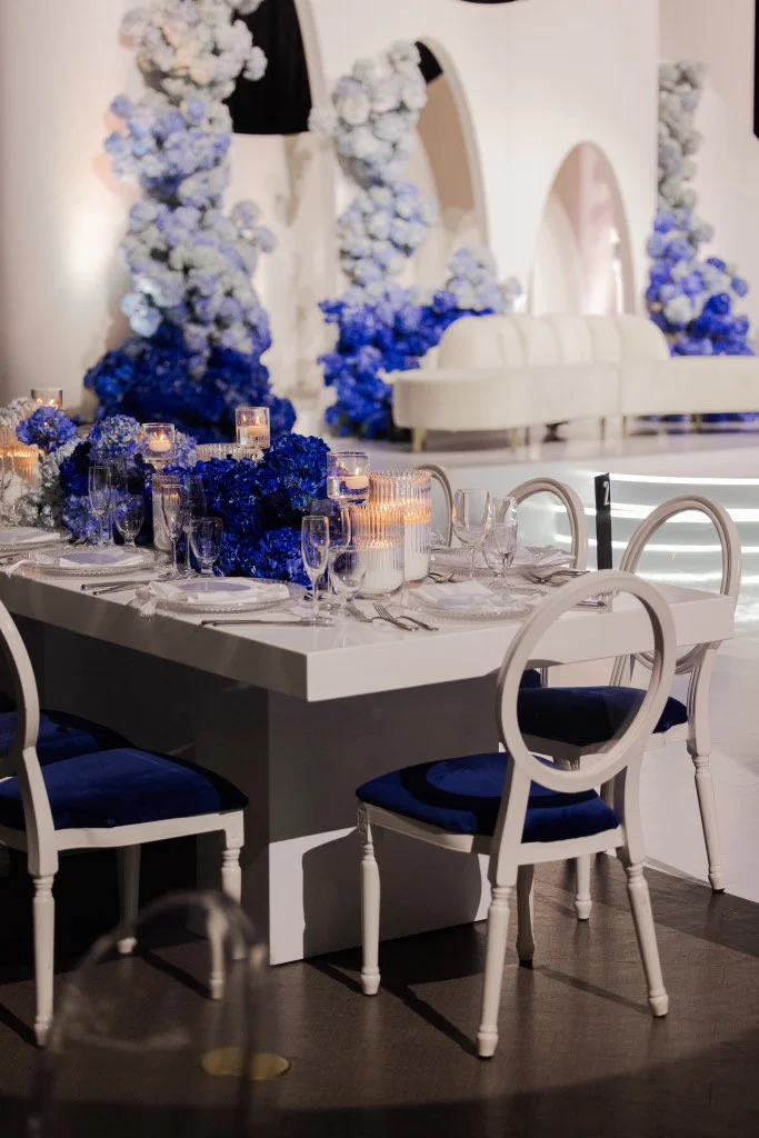
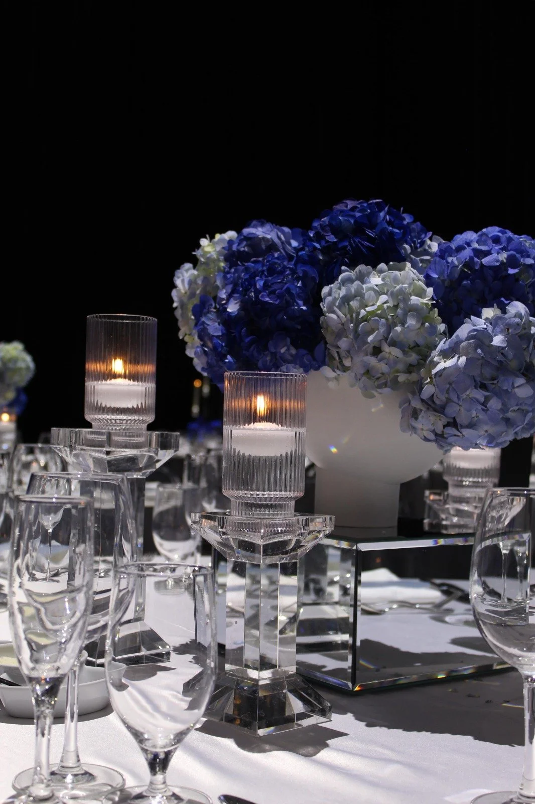
4. Blue & White — Fresh & Serene
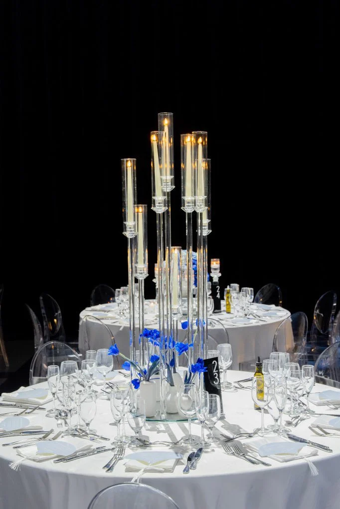
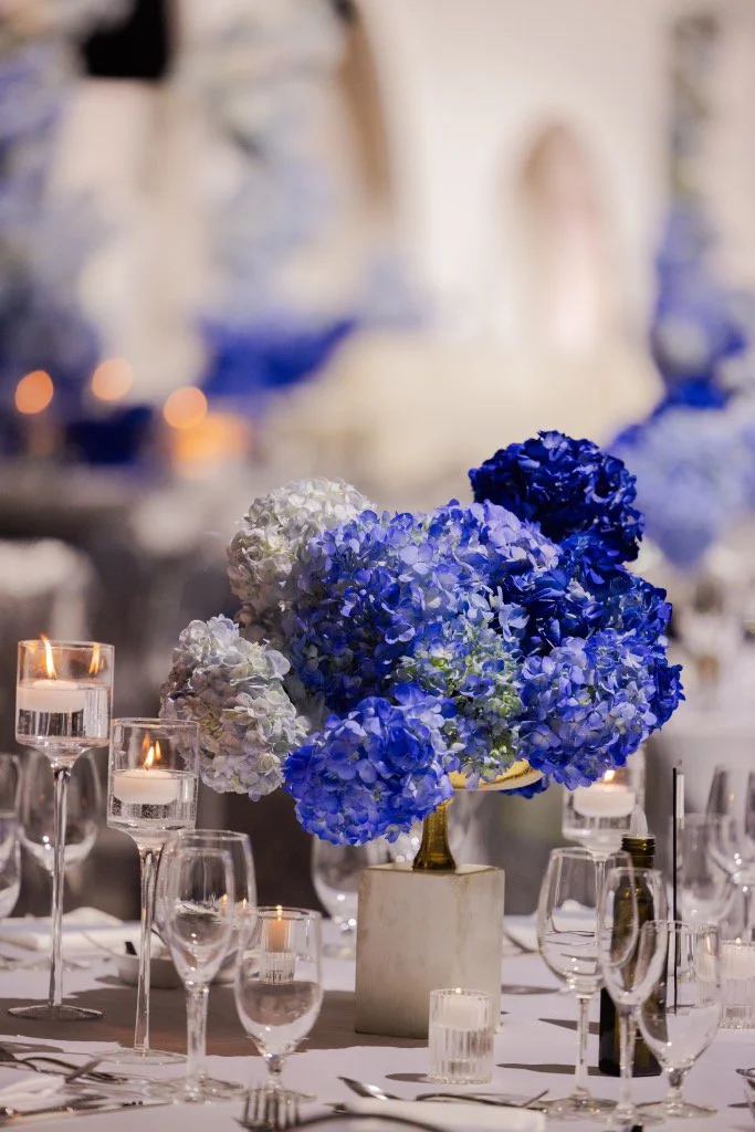
Cool and crisp, blue-and-white feels fresh, serene and quietly luxurious. At Nadeen & Amar's celebration at Paramount, we built dramatic ombré hydrangea columns climbing from deep cobalt to powder blue against a sculptural white backdrop — proof that a single hero bloom in one colour can be unforgettable.
Best for: Couples wanting a fresh, coastal-luxe or serene feel; spring and summer weddings.
Designer tip: For a blue palette, choose one hero bloom (like hydrangea) and use it in volume, in an ombré from deep to soft — it reads far more luxe than scattering blue accents around.
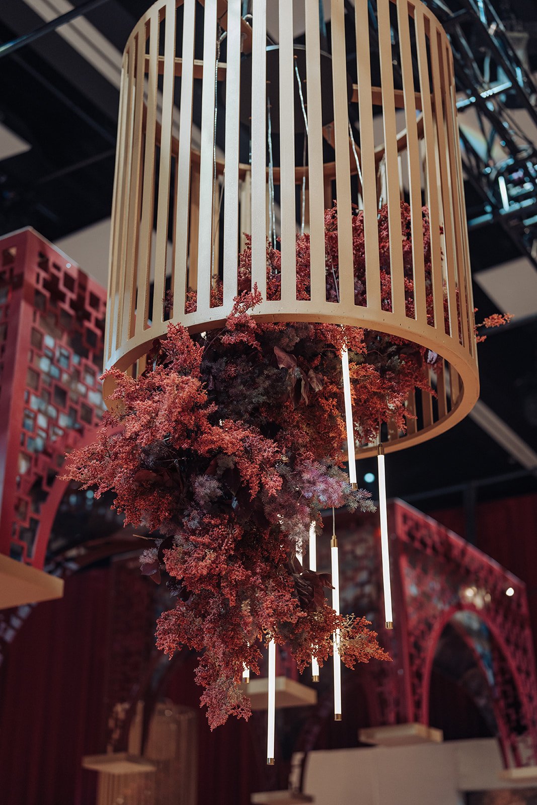
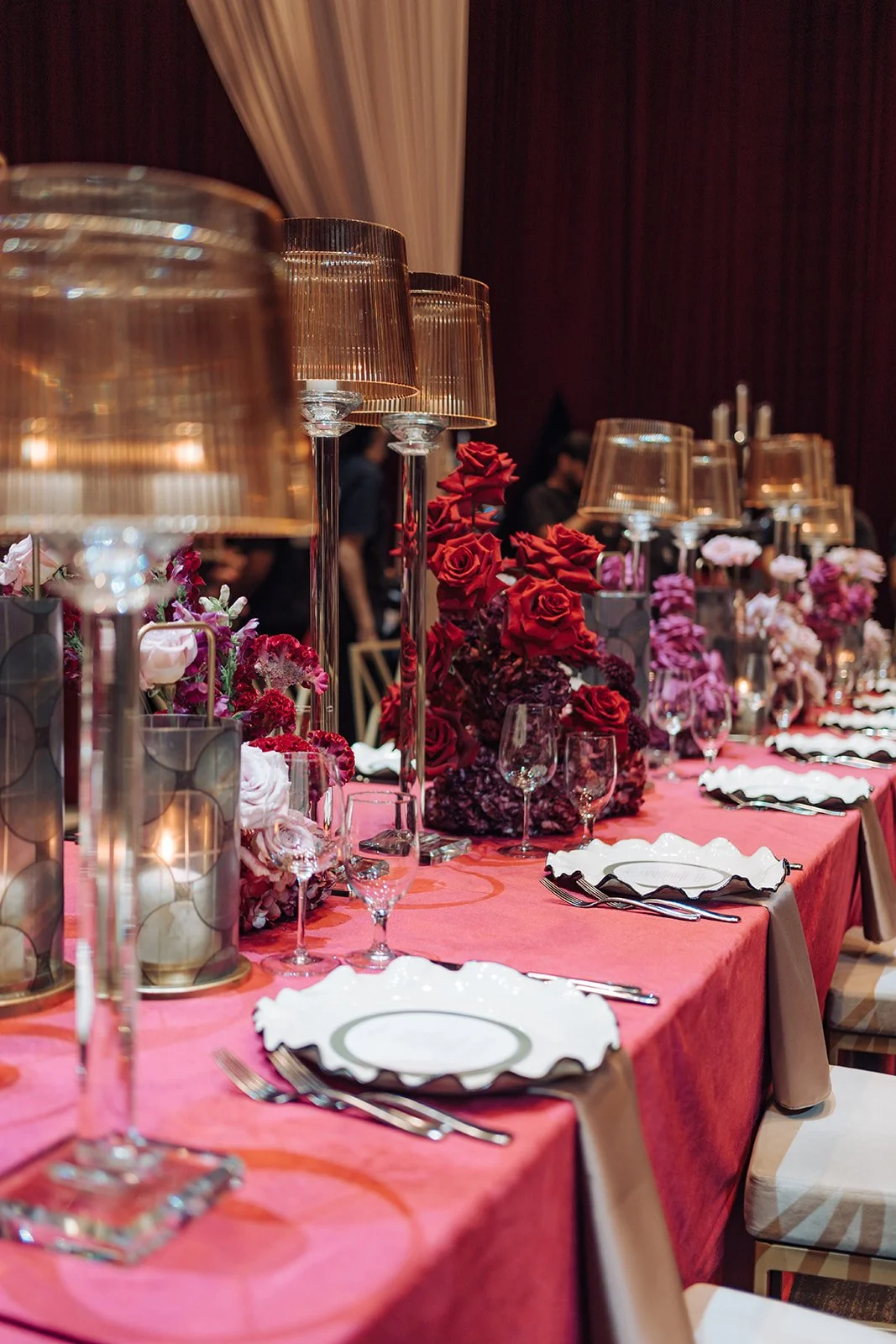
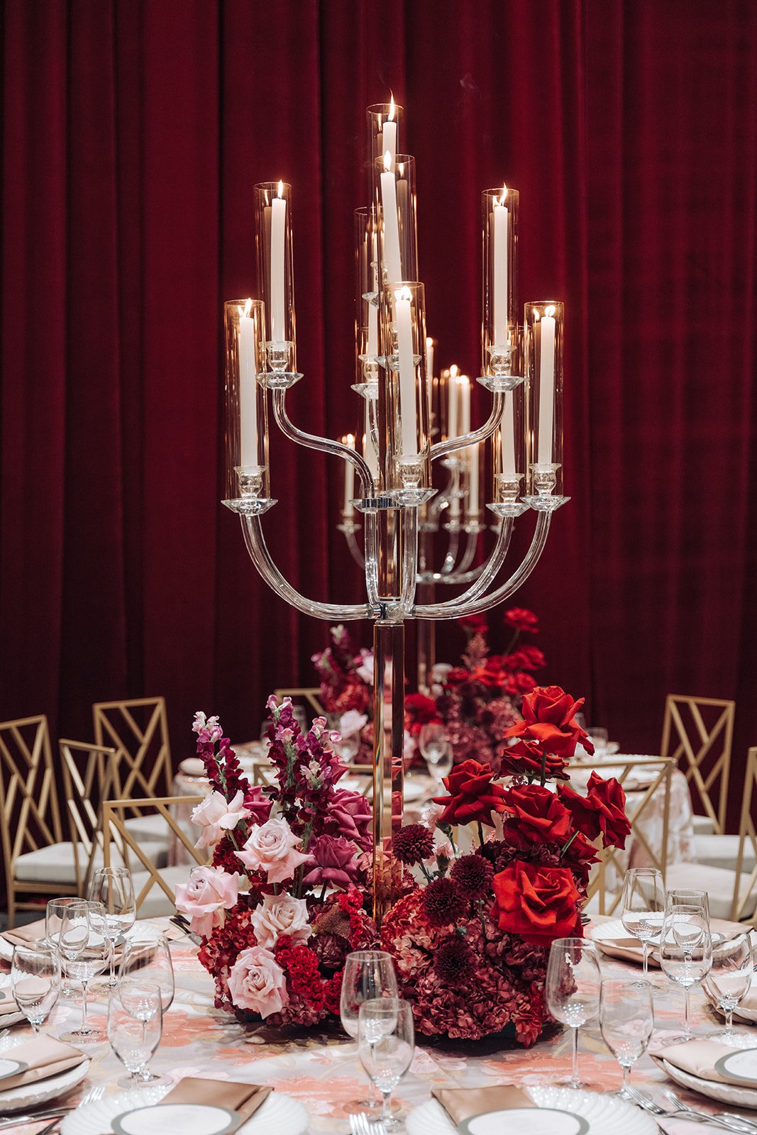
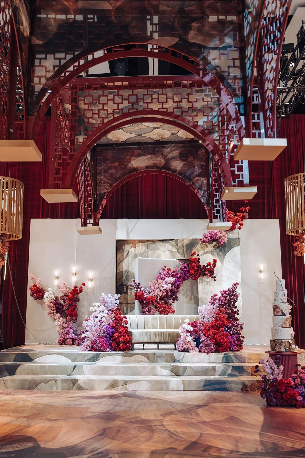
5. Red & Gold — Regal & Dramatic
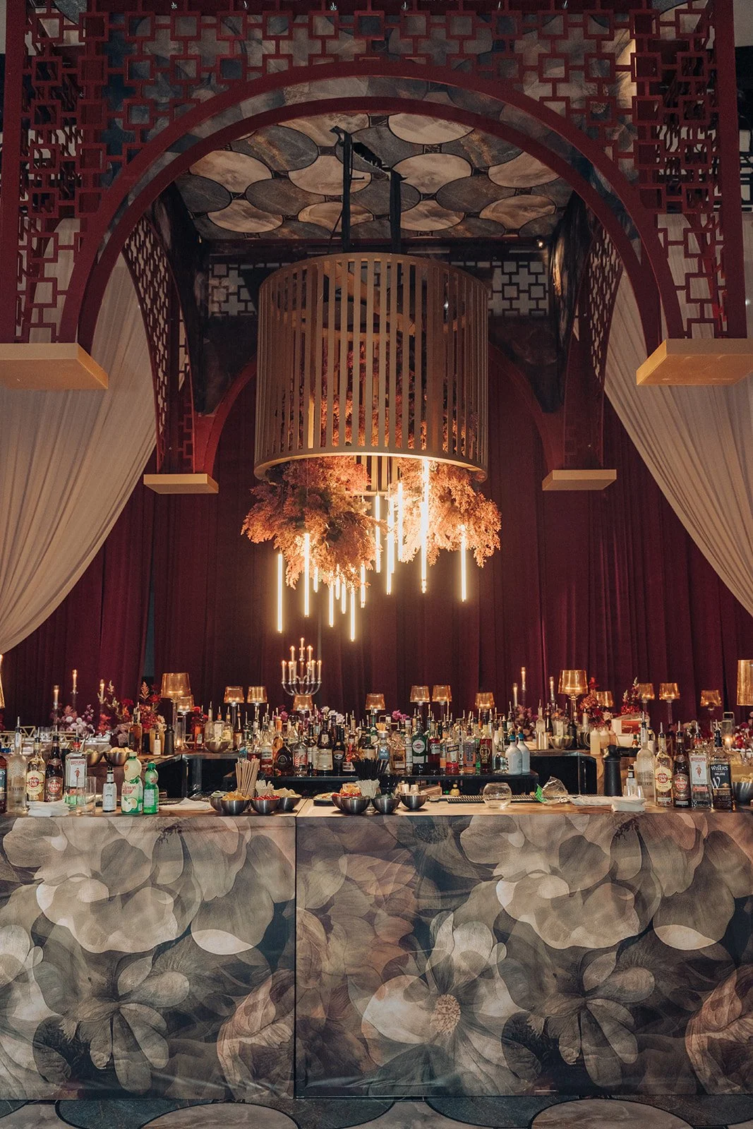
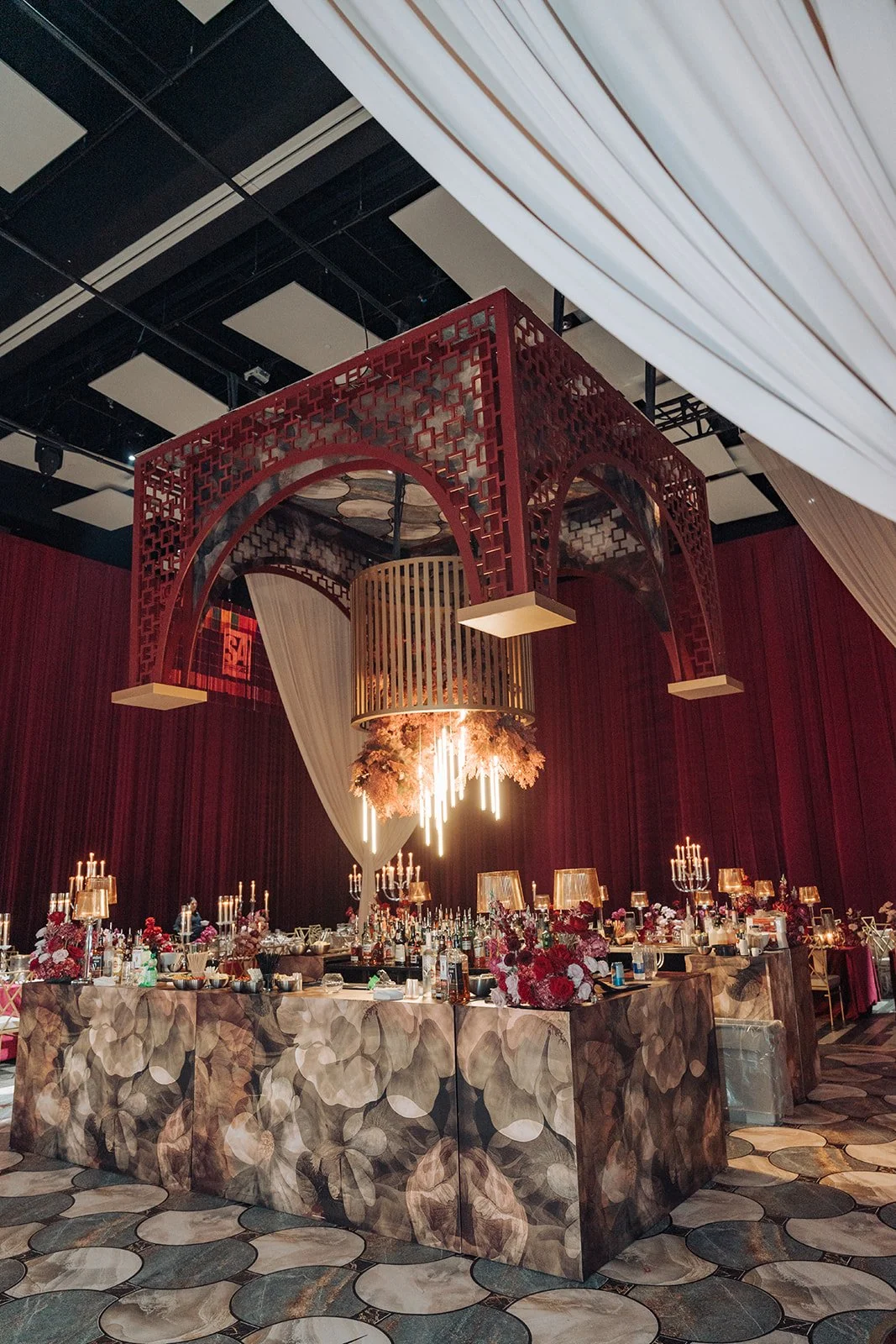
Rich reds and deep golds are timeless, ceremonial and full of impact. At Harneet & Gary's reception at Universal Event Space, we built an opulent architecture of crimson lattice, gold cage chandeliers and cascading jewel-toned florals — grand, dramatic and perfect for a celebration that honours tradition.
Best for: Traditional and South Asian weddings; couples who want a bold, regal, high-impact look.
Designer tip: Jewel palettes love candlelight and warm metals. Pair deep red with gold and plenty of candlelight so the colour glows rather than darkens the room.
6. Sage Green & Peach — Garden Classic
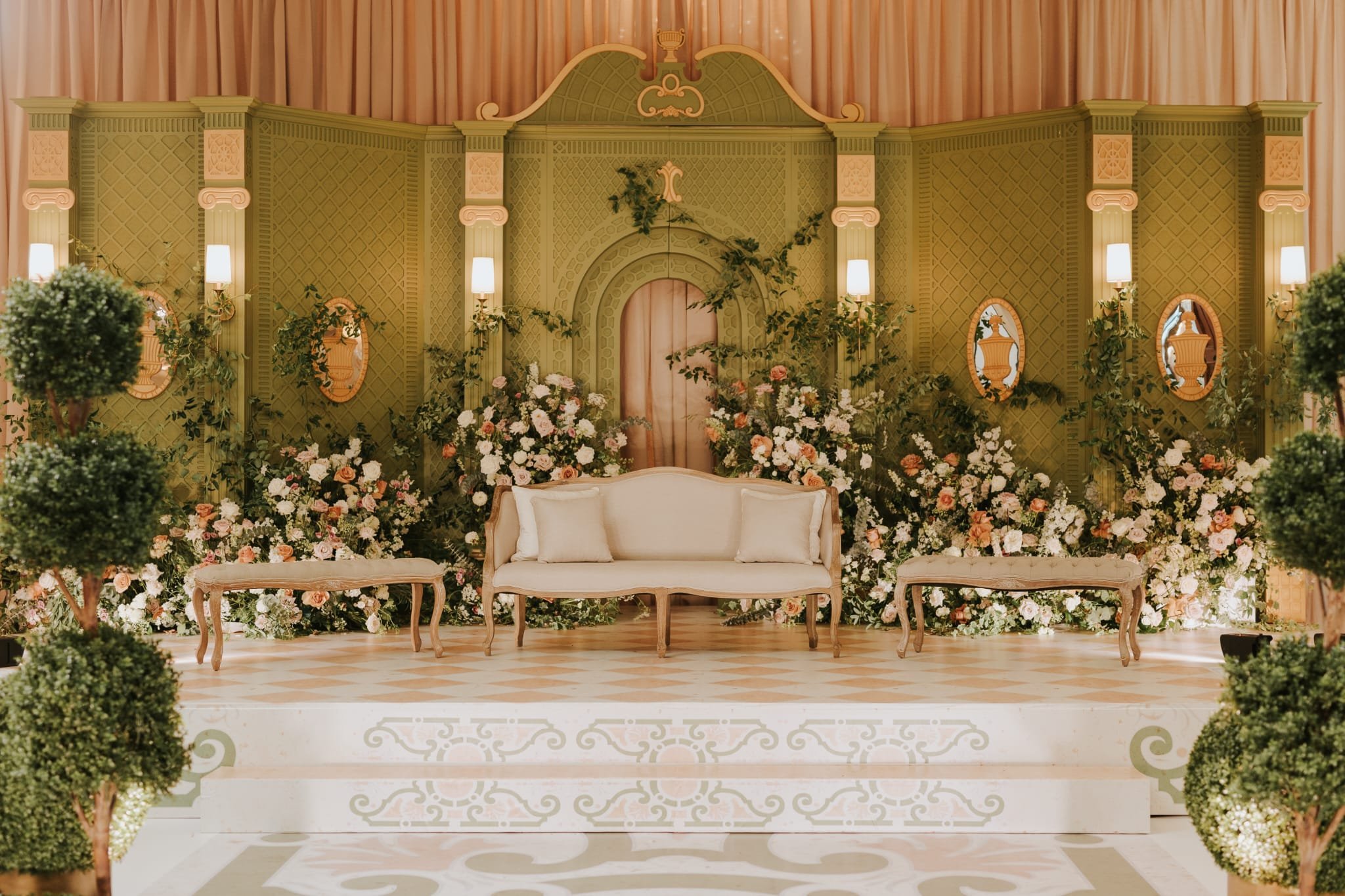
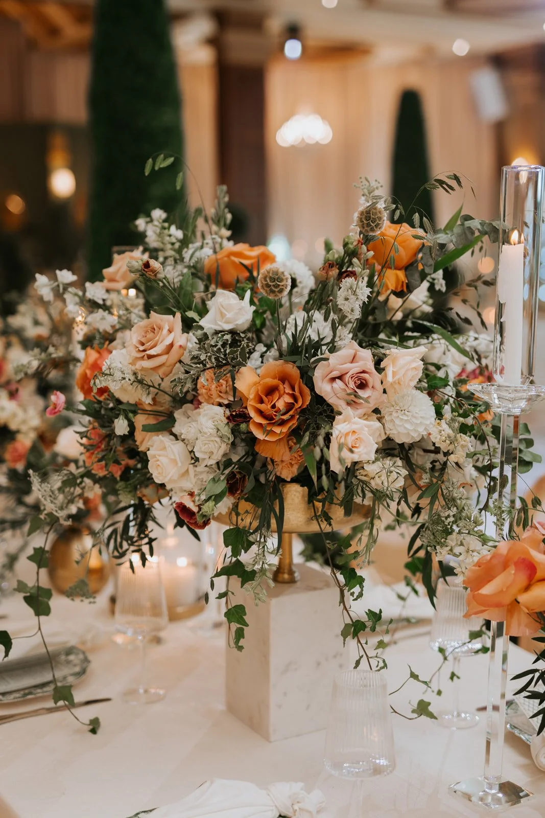
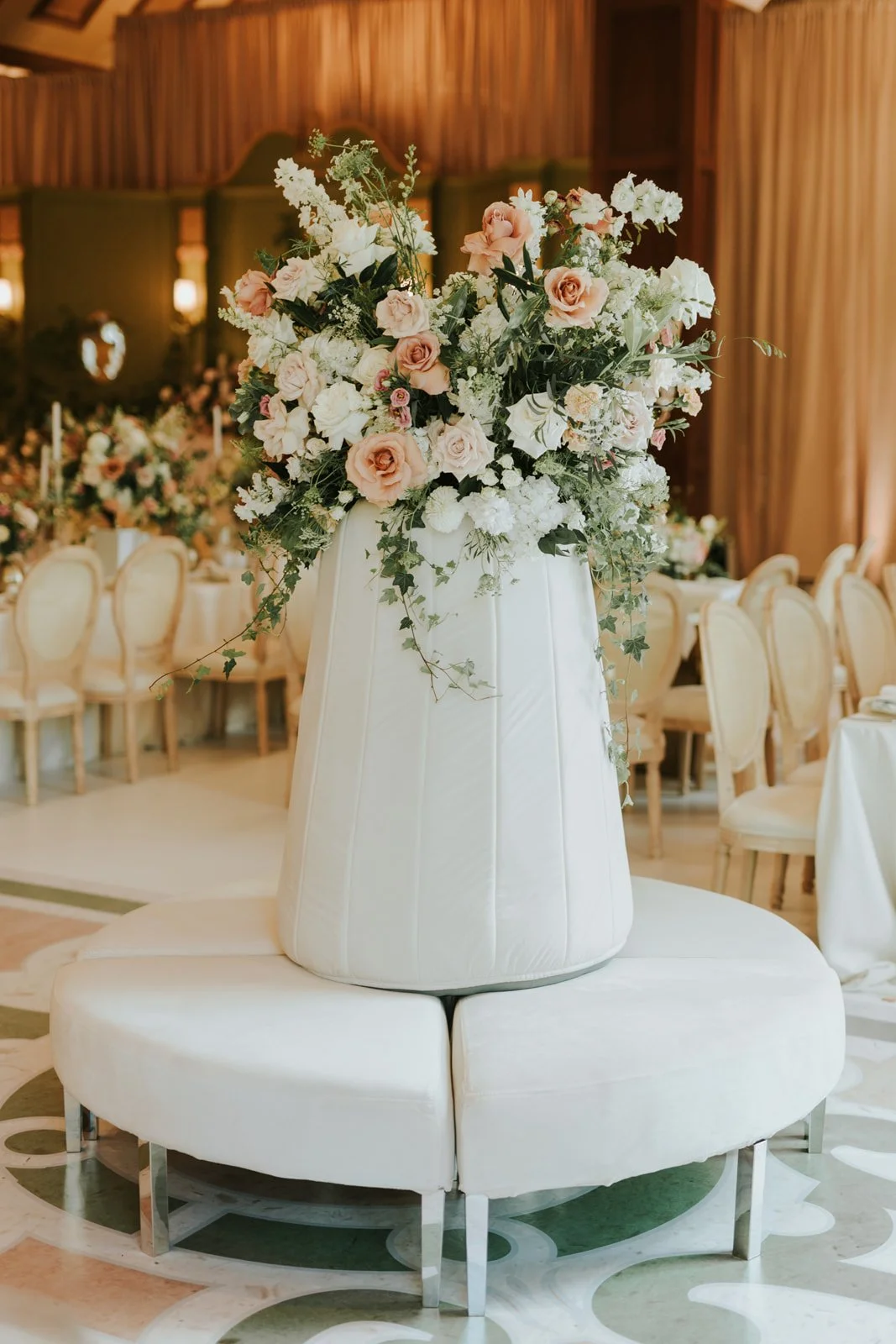
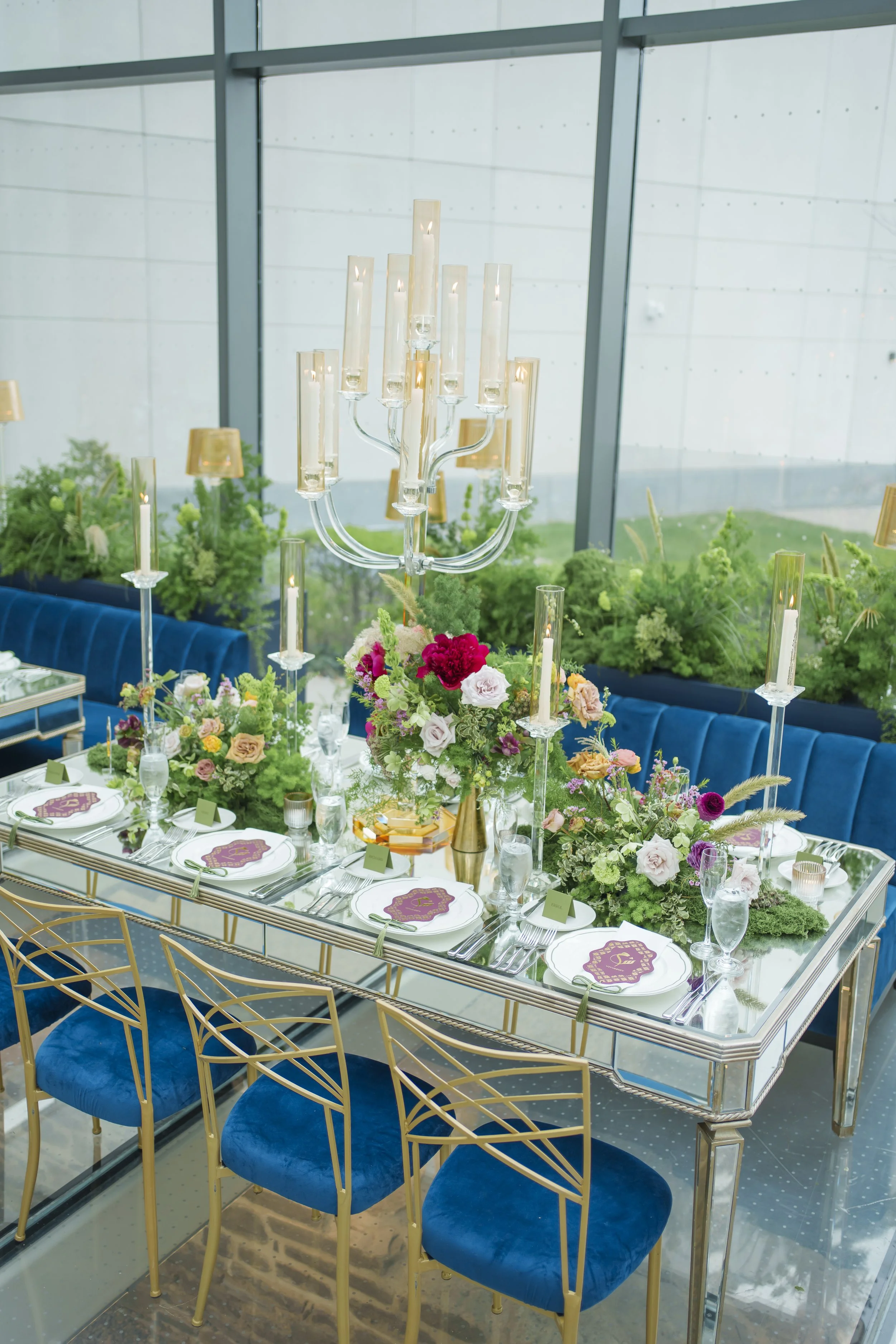
Soft sage green with peach and blush is fresh, garden-inspired and endlessly elegant. At a nikkah we designed at the Royal Ambassador, an olive-green classical backdrop met abundant peach-and-blush garden florals and boxwood topiaries for a look that feels timeless and rooted in nature.
Best for: Garden, outdoor and spring weddings; couples who love a natural, timeless palette.
Designer tip: Green reads as a neutral — treat it as your base and let peach and blush florals be the colour. It's a palette that feels fresh in any season.
Choosing & Using Your Palette: A Quick Guide
• Start with a feeling. Romantic, modern, timeless or bold — the mood points you to the palette, not the other way around.
• Consider your venue & season. A palette should complement your venue's existing tones and feel right for the time of year.
• Use the 70/30 rule. Keep ~70% of the room neutral so your 30% of colour lands as intentional.
• Add a metallic. Gold, silver or crystal ties a palette together and adds instant luxury.
• Don't over-match. Perfectly matched everything looks flat. Vary tones and textures within your palette for depth.
Designer tip: Looking for 2026's most-requested neutral? See our guide to Cloud Dancer, the soft-white colour of the year — a beautiful base for almost any palette above.
Frequently Asked Questions
How do I choose a wedding colour palette?
Start with the feeling you want (romantic, modern, timeless, bold), then factor in your venue and season, and choose one dominant colour with one or two supporting tones plus a metallic. Keep about 70% of the room neutral so your colour reads as intentional.
What are popular wedding colour palettes?
Popular luxury wedding palettes include blush and gold (romantic), tangerine and green (modern), ivory and champagne (timeless), blue and white (fresh), red and gold (regal), and sage green and peach (garden). Each suits a different style and season.
How many colours should a wedding palette have?
Most luxury palettes use one dominant colour, one or two supporting tones, and a metallic — three to four in total. Fewer, well-layered colours read more elegant than many competing ones.
What is the wedding colour of the year for 2026?
Cloud Dancer, a soft, warm white, is a leading colour for 2026 — an elegant, versatile base that pairs beautifully with blush, sage, blue or gold. See our dedicated Cloud Dancer guide.
Should our wedding colours match our venue?
They should complement it. A palette that works with your venue's existing tones (its walls, flooring and fixtures) always looks more intentional than one that fights them — one reason it helps to choose your venue and designer early.
Follow Along on Pinterest
Love these palettes? We pin real weddings, colour stories and floral inspiration you can save for your own big day.
Follow Ethereal Creators on Pinterest: pinterest.com/etherealcreators [confirm your handle]
Not sure which palette is yours? That's exactly what our consultation is for — we help couples turn a feeling into a fully designed colour story. If you're planning a wedding in Toronto or the GTA, begin with a conversation.